Matching Granite to Cabinets, Floors and Light in a Temecula Kitchen
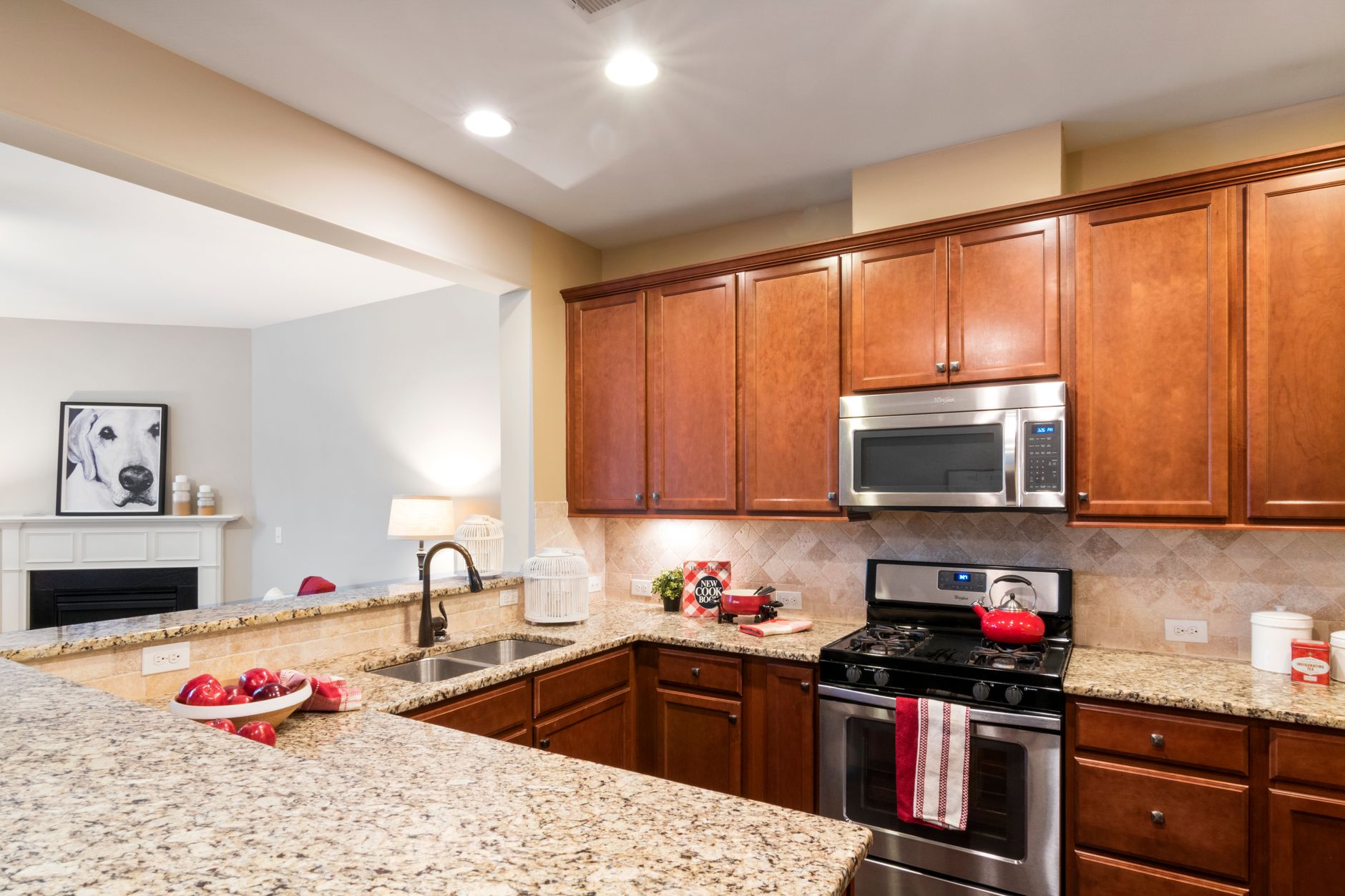
Most kitchen stone gets picked in about twenty minutes under warehouse lights, and then lives for twenty years in a room with a completely different light. In Temecula that difference is larger than people expect. The sun that crosses Riverside County in summer is strong and low in the afternoon, and a slab that looked quiet in the yard can look busy, warm or flat once it is set against cabinets and floors at home. Matching granite to a kitchen is mostly a question of undertone, light and scale, and each of those can be checked before anything is cut.
What is undertone, and why does it decide the match?
Every granite has a base color and an undertone sitting beneath it. A slab that reads as gray may lean blue, green, brown or pink, depending on the feldspar and mica in it. The undertone is the part that fights with, or agrees with, the cabinets and floor. A warm honey oak floor will pull the brown out of a gray granite and make it look muddy, while the same floor makes a gold and cream granite look settled. The quick test is to hold a white sheet of paper next to the slab. Against pure white, the undertone separates from the main color and becomes obvious.
Cabinets bring their own undertone, and so does the paint on the wall. Stucco exteriors in Temecula tend toward sand, tan and warm gray, and the interior colors often follow, which is why browns and golds in granite tend to look at home in this part of the Inland Empire. That is a tendency, not a rule. A white or pale gray kitchen can carry a darker stone with blue or black in it very well, and the result looks crisp rather than heavy.
How do cabinet and floor colors pair with granite?
The table below is a starting point that crews use when a homeowner arrives with a cabinet door and a floor sample and no firm idea. It is not a recipe, since the actual slab always has the last word, but it narrows a yard full of stone down to a handful worth walking up to.
| Cabinet color | Floor tone | Granite leaning that usually works | What to watch for |
|---|---|---|---|
| White or cream | Warm wood or tile | Gold, brown and cream with moderate veining | Very pale stone can look washed out beside bright white |
| White or cream | Gray tile or vinyl plank | Gray with black flecks, or soft blue gray | Cool stone beside a cool floor can feel cold |
| Dark espresso | Medium or dark wood | Light gold, beige, or a stone with white veining | Dark on dark hides the edge profile |
| Medium oak or maple | Tile in sand tones | Brown with a touch of gold, green or burgundy | Busy stone against busy grain looks crowded |
| Painted gray or navy | Light wood or pale tile | White or pale gray with soft movement | Strong black clusters can overpower the cabinets |
| Painted sage or green | Warm wood | Cream, tan or stone with a hint of green | Pink undertones clash with green paint |
A table like this works best when it is checked against the actual samples laid side by side. Phone photos shift color badly, so a door, a floor sample and a stone chip are better held in one hand under the window of the real room.
What does Temecula light do to a slab?
Sun entering a kitchen from the west can wash a polished slab with glare for an hour or more, and a kitchen with a big sliding door or a window over the sink will see it daily. Polished stone throws that light back and deepens every color in the slab, so a granite with strong mica sparkle will flash. A honed finish absorbs the same light and reads a shade softer. A leathered finish scatters it across a textured face. If the room faces west or has few windows, it helps to look at the slab twice, once in the open yard doorway and once under the yard roof, since the two views can differ a great deal.
North facing kitchens and rooms shaded by deep eaves or covered patios are the opposite case. They carry less light, so a very dark granite can turn nearly black in them, and the veining disappears. A medium tone with visible movement keeps some life in a darker room. Homes in the older neighborhoods along Murrieta Creek and in the hillside developments toward the Santa Rosa Plateau often have deep roof overhangs for the summer heat, and those kitchens tend to lean darker in feel than the builder's lighting suggests.
How much movement is too much?
Movement is the crew word for the flowing veins, bands and swirls through a slab. Quiet granite has small, even grains and reads almost like a speckled surface. Active granite has large ribbons, clusters or waves that travel across the full slab. Neither is better, but scale matters. A small galley kitchen with a lot of cabinets already in view usually looks calmer with quieter stone, while a large island kitchen can carry a bold slab as a centerpiece and often benefits from it.
Think about where the eye lands. An island or a peninsula with an overhang is the main show in most kitchens, and the busiest part of a slab can be positioned there on purpose. The perimeter runs along the walls can then take the quieter stretches of the same slab. When a slab is laid out on the template, the fabricator can shift the pieces around to place the strongest pattern where it will be seen, and the same slab can look quite different depending on that decision.
Do hardware, backsplash and appliances matter?
They do, because they sit right beside the stone. Stainless steel is cool and neutral, and it goes with nearly any granite. Black appliances disappear against dark stone and stand out against light. Brushed brass or bronze pulls and faucets pick up the gold flecks in a warm granite and can look deliberate, while chrome picks up the gray and silver. If a backsplash is going in, it should usually be quieter than the countertop. A strongly veined granite with a strongly patterned tile is a recipe for visual noise, whereas a plain subway tile or a simple stone strip lets the slab speak.
The sink matters too. An undermount sink leaves the edge of the cutout exposed, so the polished edge around it becomes part of the look, and a dark sink in a pale slab creates a strong line. A white or light sink in a similar tone blends into the stone and stays calm.
Which finish and edge profile suit the match?
Finish changes color perception. A polished finish deepens everything, a honed finish pulls colors toward gray and softens contrast, and a leathered finish adds a visible texture that reads as slightly darker. A slab that feels a bit too busy in polished form can feel tamer once honed. The edge profile has an effect as well. An eased edge is plain and makes the stone itself the subject, a bullnose is soft and traditional, and a beveled edge adds a thin line of light along the front. A profile with a lot of curves tends to suit a traditional kitchen and can look fussy next to flat modern cabinet doors.
What should be checked before the slab is tagged?
- Hold the cabinet door, floor sample and a paint chip next to the actual slab, not a photo.
- View the slab in daylight at the yard door and again under the roof.
- Look at the whole slab upright, then decide where the busiest part will sit.
- Check for fissures or pits, especially where a sink cutout is planned.
- Ask what finish the slab is available in, and look at a sample of it honed if the choice is open.
- Take a photo of the tagged slab on the rack so the right one is cut later.
Picking granite is easier when the room is treated as the judge instead of the yard. Bring the pieces of the kitchen to the stone, stand in the daylight, and let the slab that still looks right there be the one that gets tagged.